- My role
- Head of Design. Creative direction, the plan, the split and the tracking.
- Team
- Two brand designers, a product designer and a frontend engineer, with marketing, product and engineering
- Time
- Mid August to 5 October 2026, then the long tail through Q4
- Measured by
- A growth team objective I proposed, with four key results
Day one was already decided
The deal closed in mid August, and the announcement went out the same day. From that moment, every customer who opened a BVNK page expected to see Mastercard on it. So the first stage had to be ready for the announcement: a transitional identity where the BVNK wordmark we all knew carried an endorsement, “by Mastercard”.
The second stage was the real work. We gave ourselves two months to launch the refreshed website on the full identity, plus every asset in heavy rotation. The date was 5 October. We made it.
- Mid AugDeal announced. Transitional identity live.
- 5 OctWebsite, sales library, social and email on the full identity.
- End of Q4Product and internal portals. The last pixels.
Two brands, the best of both
Mastercard gave us trust, reach and a brand system the whole world recognises. BVNK had things worth keeping too: a gradient people associated with us, and a network-line pattern that customers, partners and developers knew. My call as creative director was to keep both and let them evolve inside the Mastercard system, so the change read as continuity.

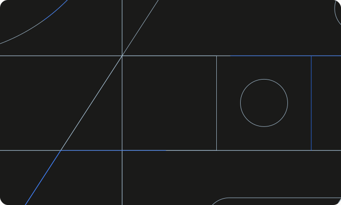
The pattern is the clearest example. The original lines stayed, and Mastercard’s circles gave them a calmer, more premium rhythm. It sits in the background as texture and never fights the content.

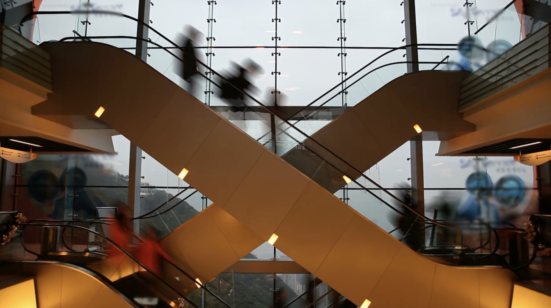
Colour moved from cool, saturated blues and mint to Mastercard warmth. Neutrals do the heavy lifting, orange is the signature, and the gradient is saved for the moments that matter.
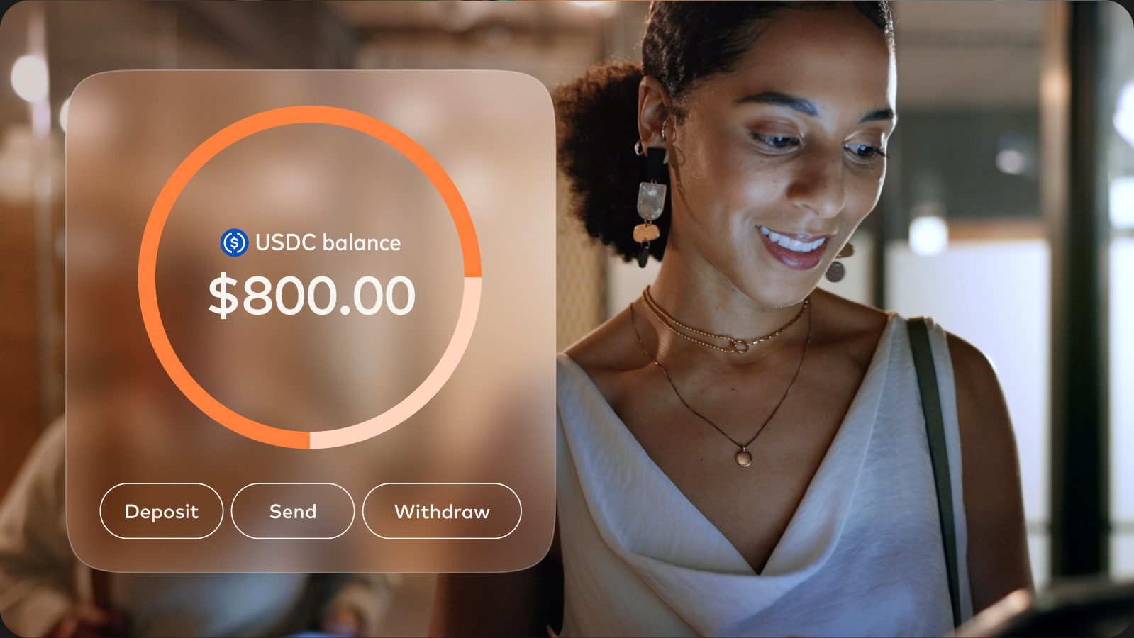
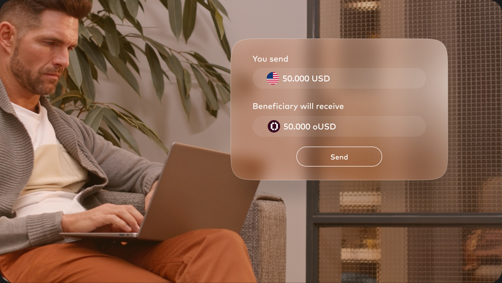
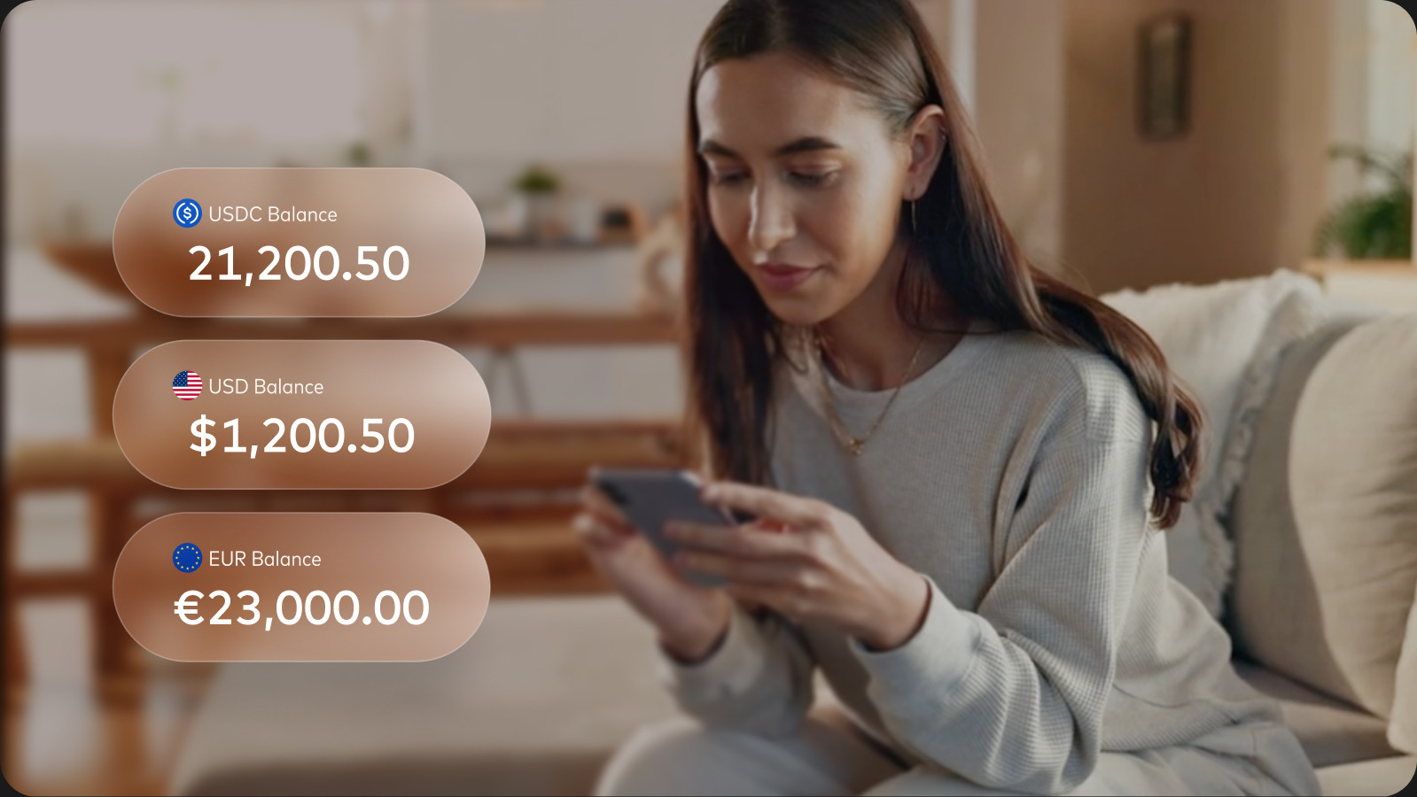
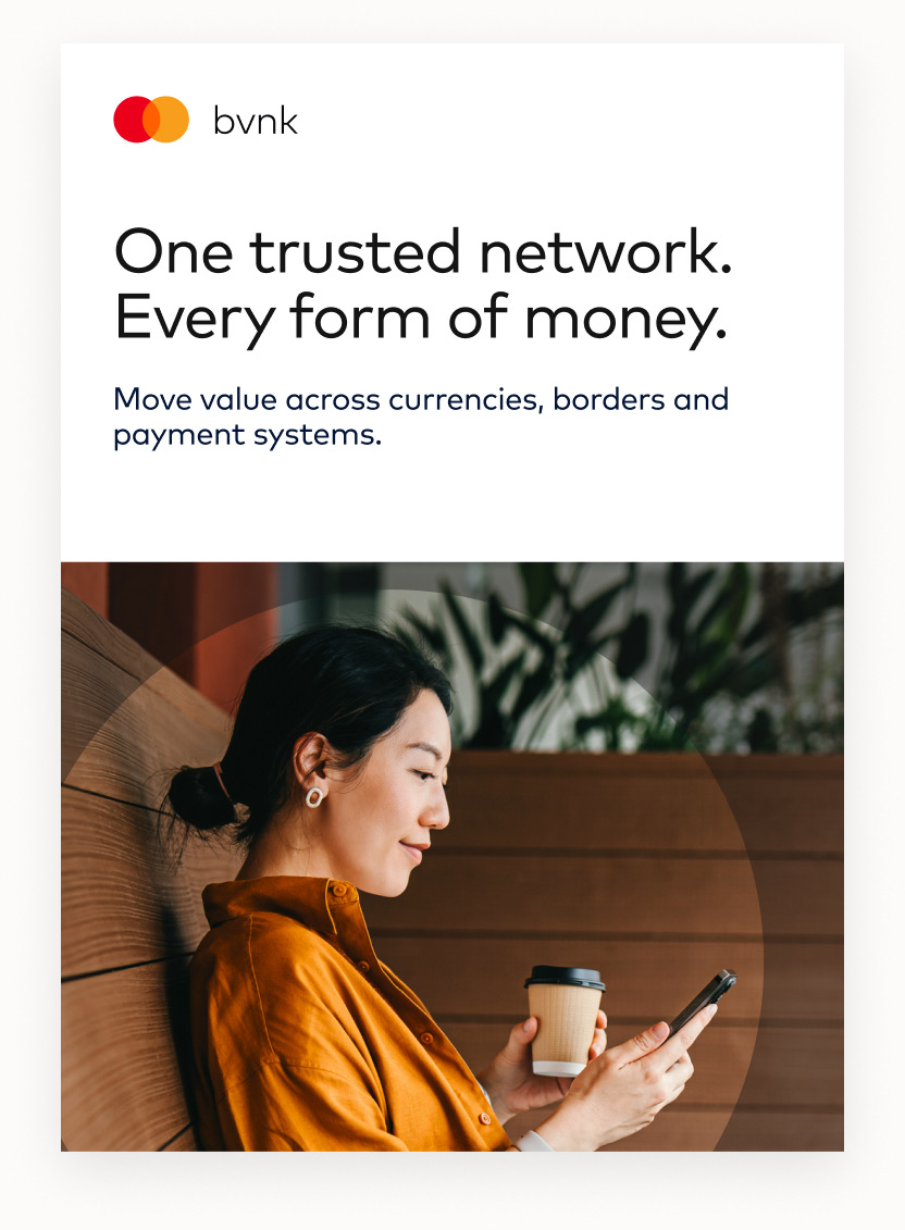
Photography went human: real people mid-moment, in warm light, cropped by the circles.



And the product shows up as Mastercard’s glass: frosted cards that float over photography, tinted with the brand orange.
Splitting the work
Before anyone opened Figma, I spent time with BVNK and Mastercard leadership: aligning on the direction, walking them through the two stages and agreeing the timelines. Every approval line we’d need later was mapped at this point.
Then I split the work three ways, by type, and gave each type to the designer whose strengths fit it best.
The lead brand designer and I built the bulk of it together: the system and the websites. That meant bvnk.com and every portal around it, from docs to the status page and the trust centre. The second brand designer took most of the collateral. A product designer, working with a frontend engineer and under my supervision, brought the new style into the product itself.
Tracking it, out loud
A rebrand this wide fails quietly: one stale factsheet, one blue email footer. So I made the progress public inside the company and made it measurable.
I proposed the objective to the growth team: make every customer touchpoint feel like part of Mastercard. It sat under the company goal of increasing pipeline, with four key results.
- One brand system anyone can pick up. Every element documented and approved by Mastercard, and rated 5 out of 5 for ease of use by 90% of internal teams.
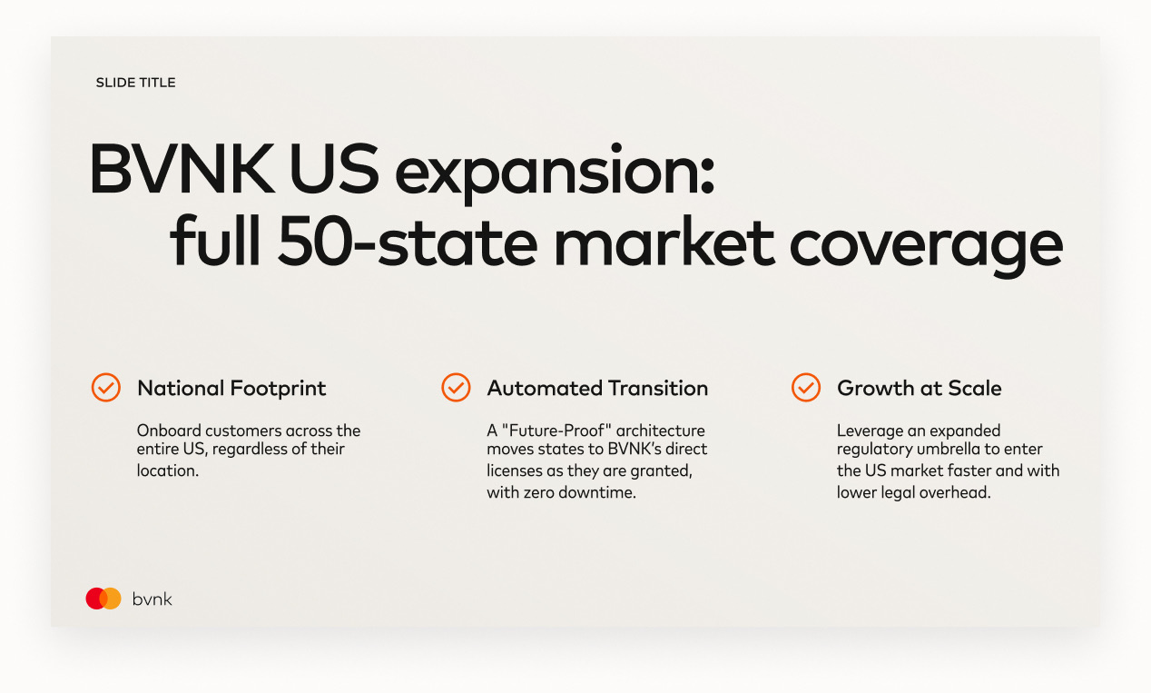
- 7 of 7 web channels and email. bvnk.com, docs, help centre, trust centre, status page, careers and email templates, each live and signed off.
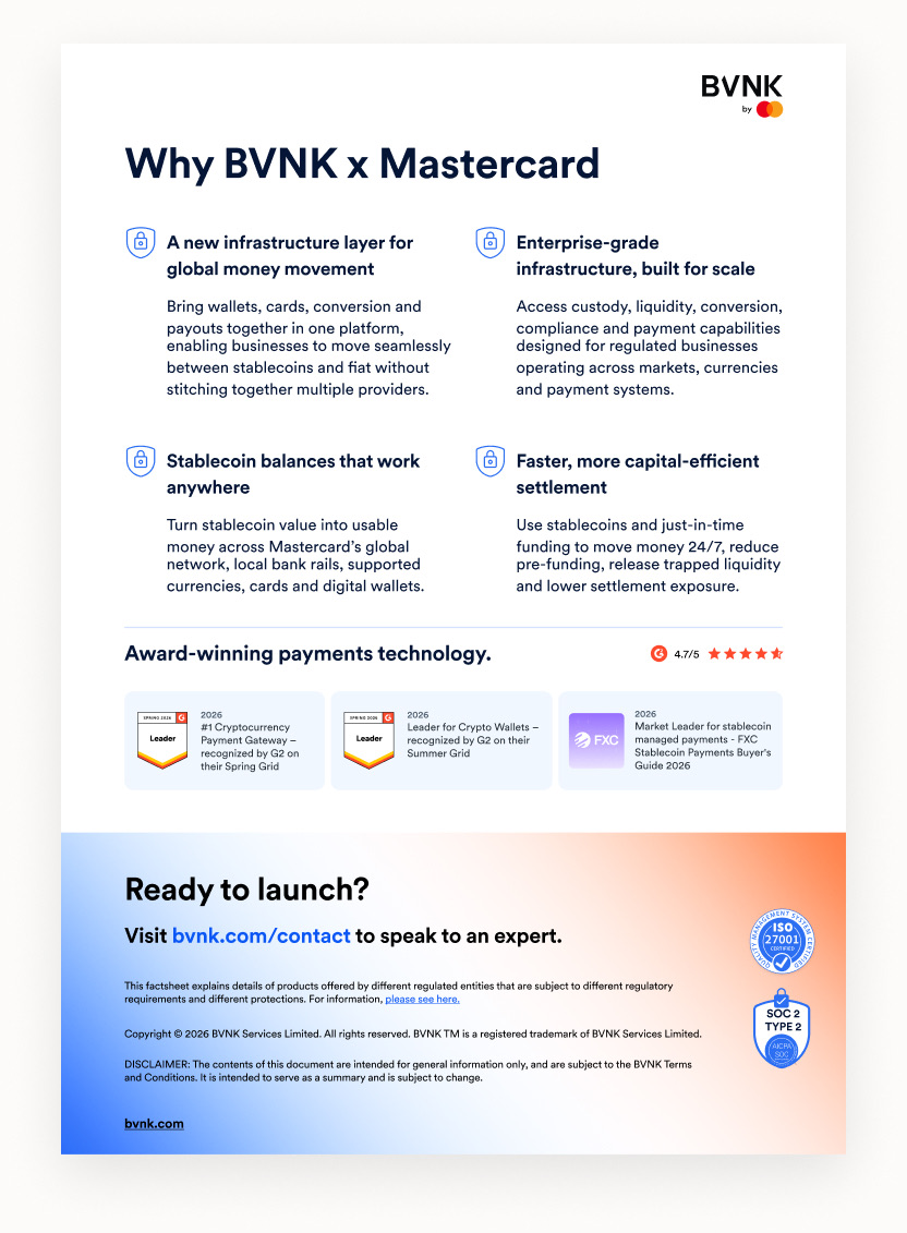
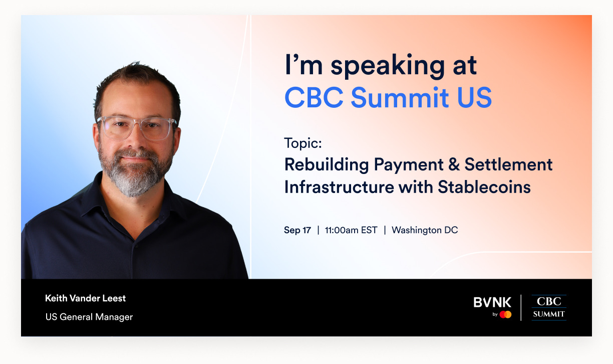
- 100% of the sales library and social output. Master deck, factsheets, one-pagers and enablement decks, plus every post on LinkedIn, X and YouTube.
- 4 of 4 customer-facing apps. The design system speaks Mastercard's visual language, and every product runs on it.
Underneath, the work lived in Jira epics and tasks. On top of them sat weekly updates, KR check-ins, a post in our Shipped channel for every release, episodes of Behind the Pixels and an all-hands presentation. It went to the company weekly and monthly, and more often when the scope or audience called for it.
Everywhere it landed
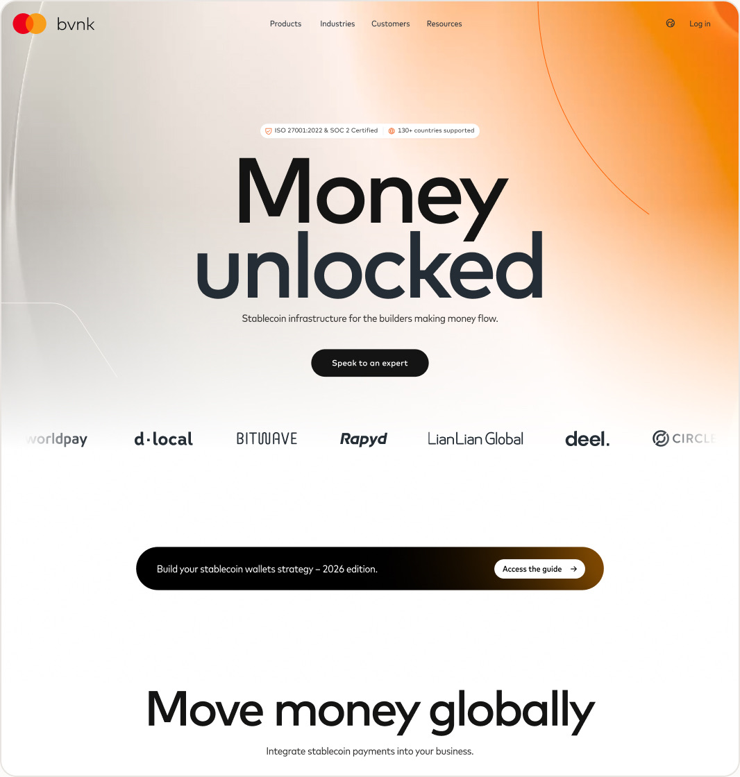
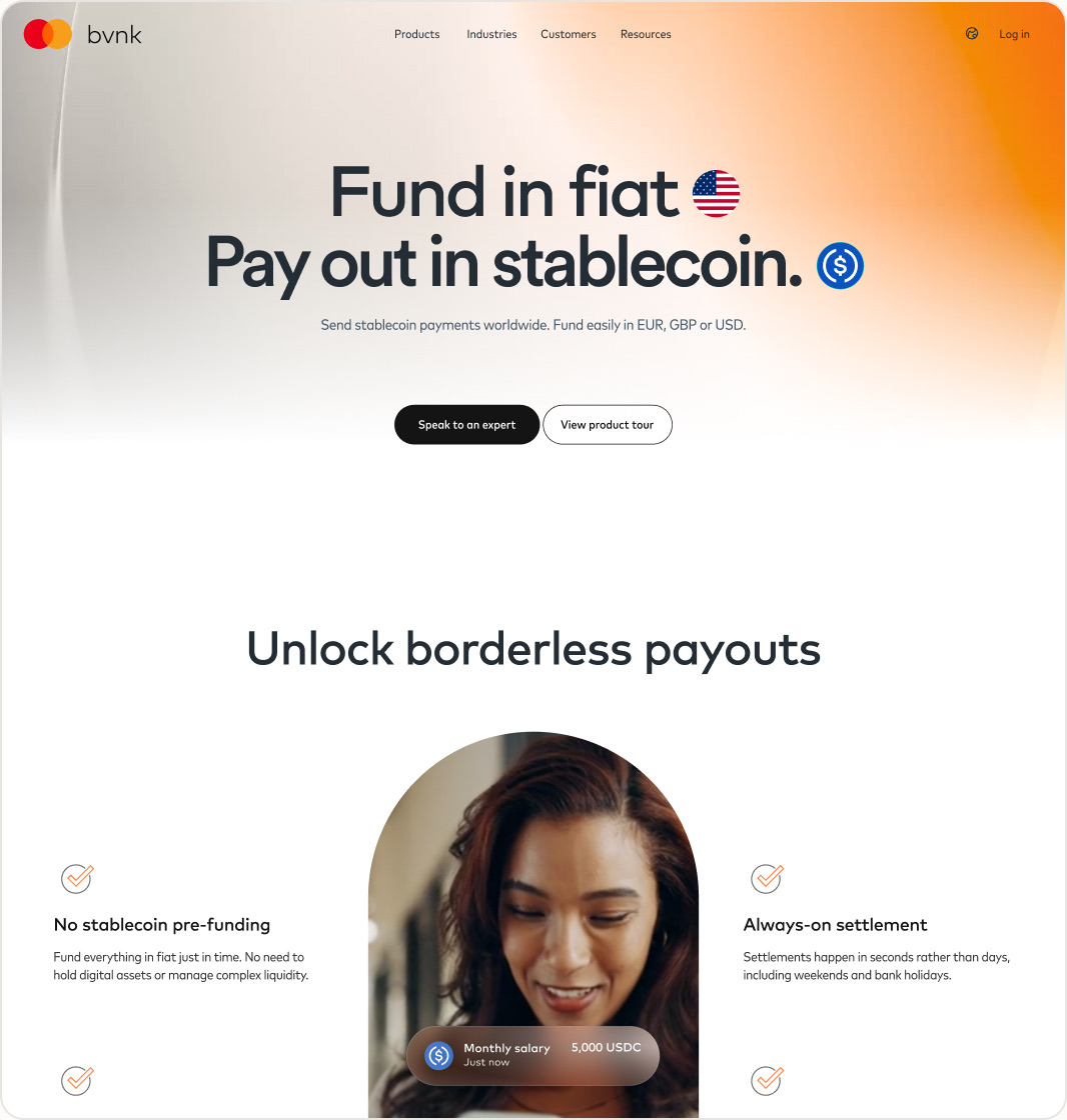
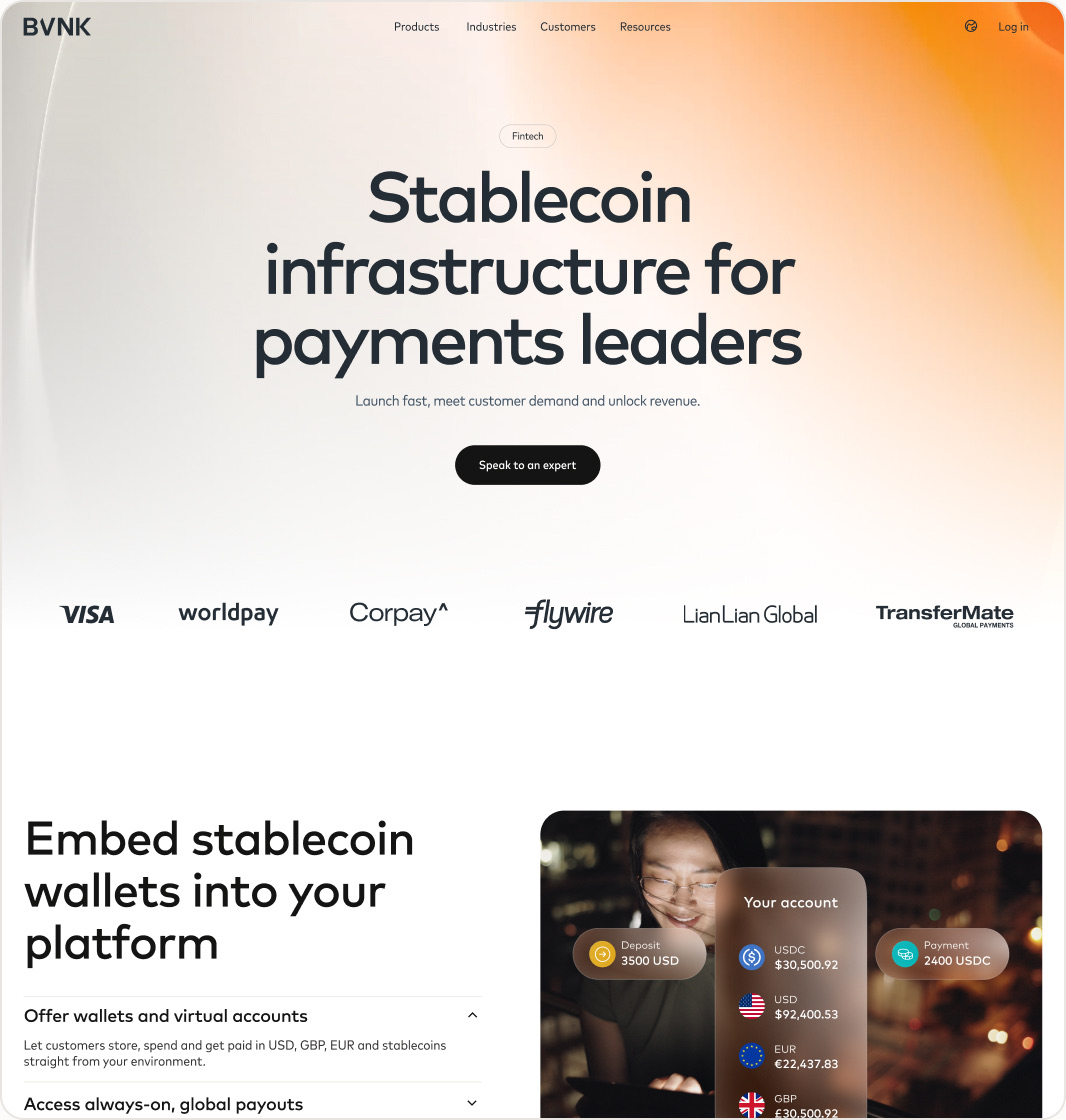
- 40+
- pages migrated, across three website locales
- 7/7
- web channels and email live
- 5
- social posts a week, all on the new templates
- 2 to 3
- blog posts a week, plus older posts and reports redone
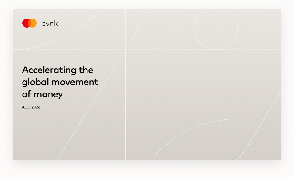
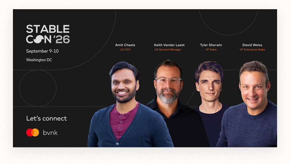
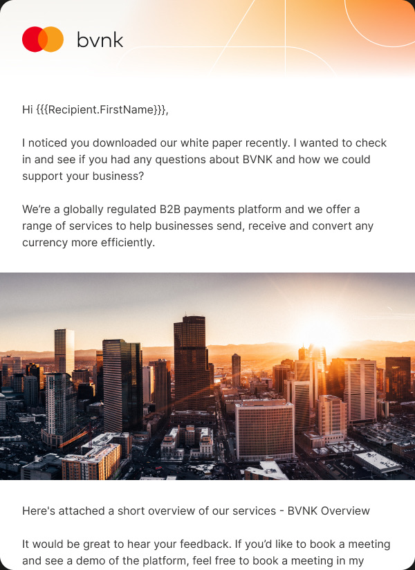
New images, new UI and new animations everywhere. The sales library moved over in one go, so a buyer never saw two brands in the same meeting.

What surprised me
Honestly, that we pulled it off. A full rebrand in under two months, through every line of approval two companies need. Part of that is how efficient this team is. The other part is how much of the repetitive work AI could take off our hands, so the team’s time went into the decisions.
Product followed by the end of November, and the internal portals close out the year.